A new logo & Visual Identity for ERAA
Highlighting the key role of regional aviation
The challenge
The European Regions Airline Association (ERAA) needed a modern visual identity that better reflected the vital role regional airlines play in connecting communities, businesses and regions across Europe. The new brand needed to communicate connectivity, movement and accessibility while positioning ERAA as a forward-looking and influential voice for regional aviation.
What we did
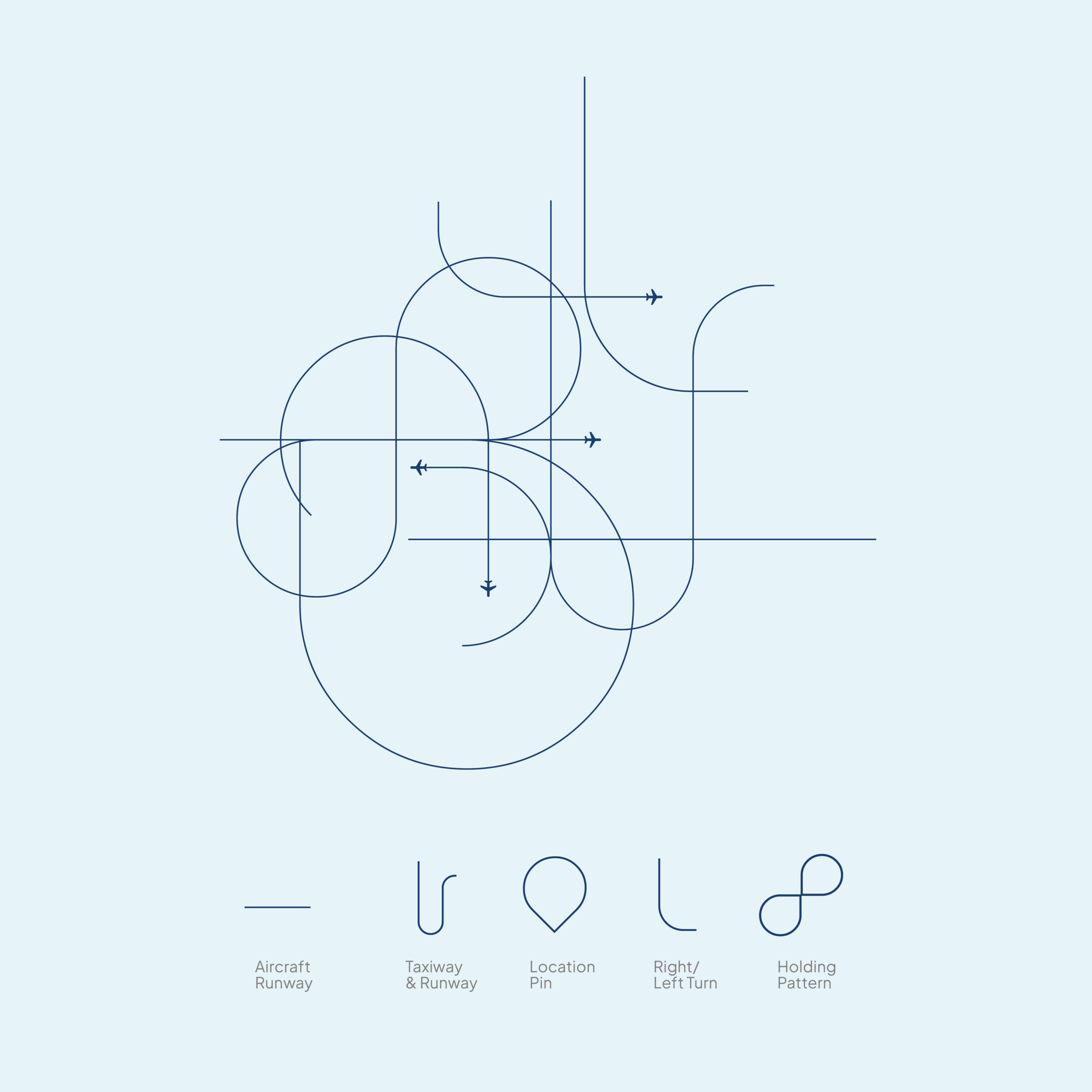
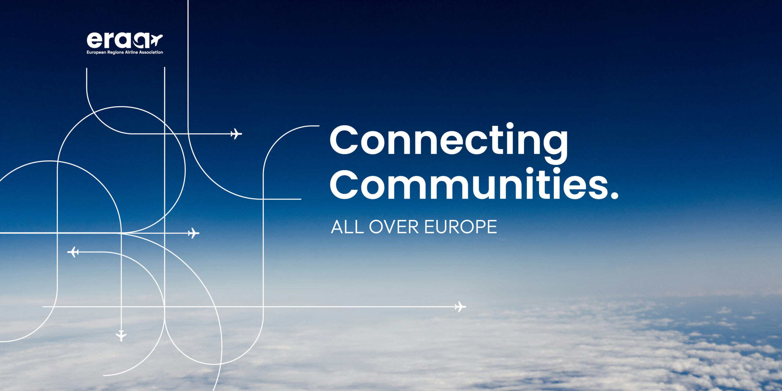
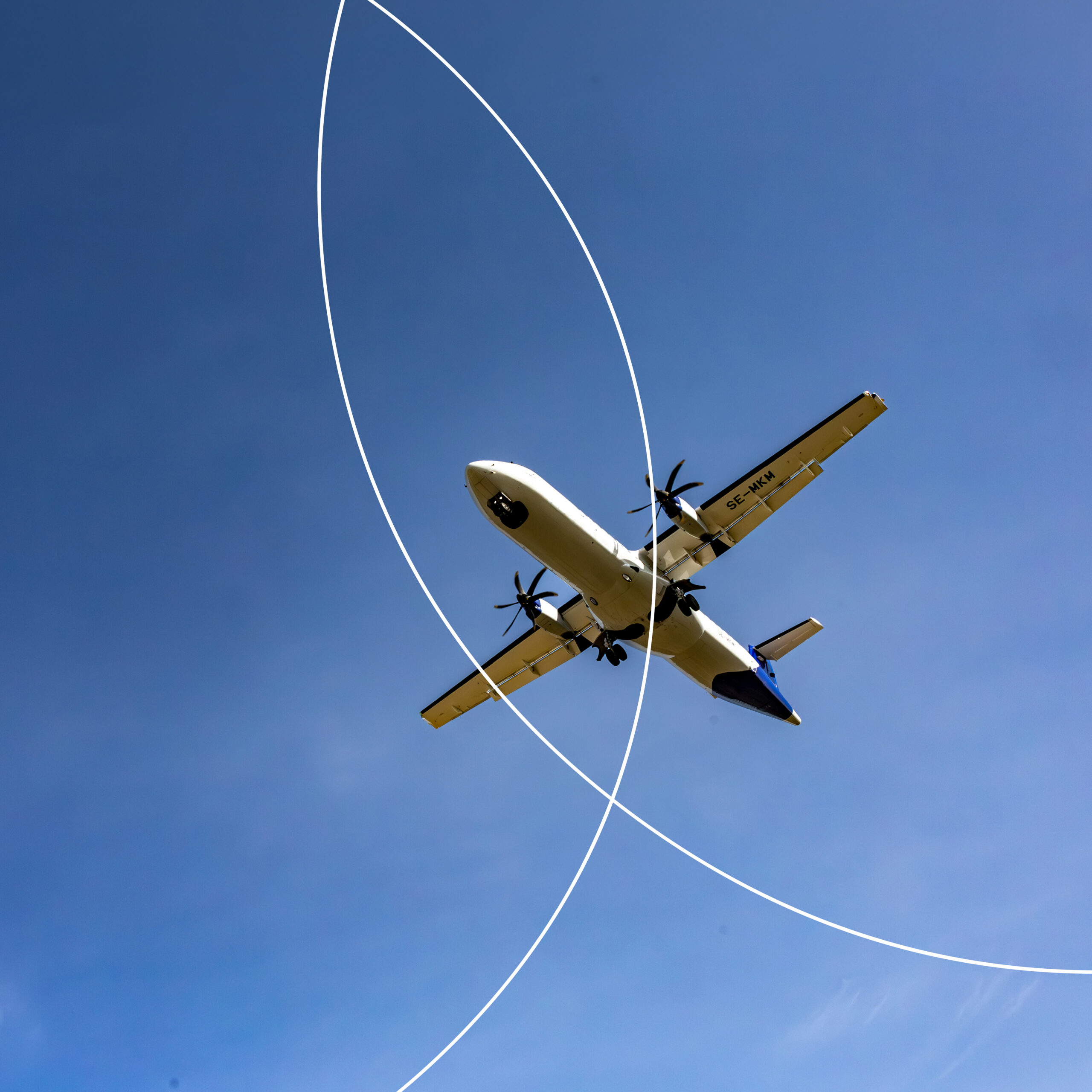
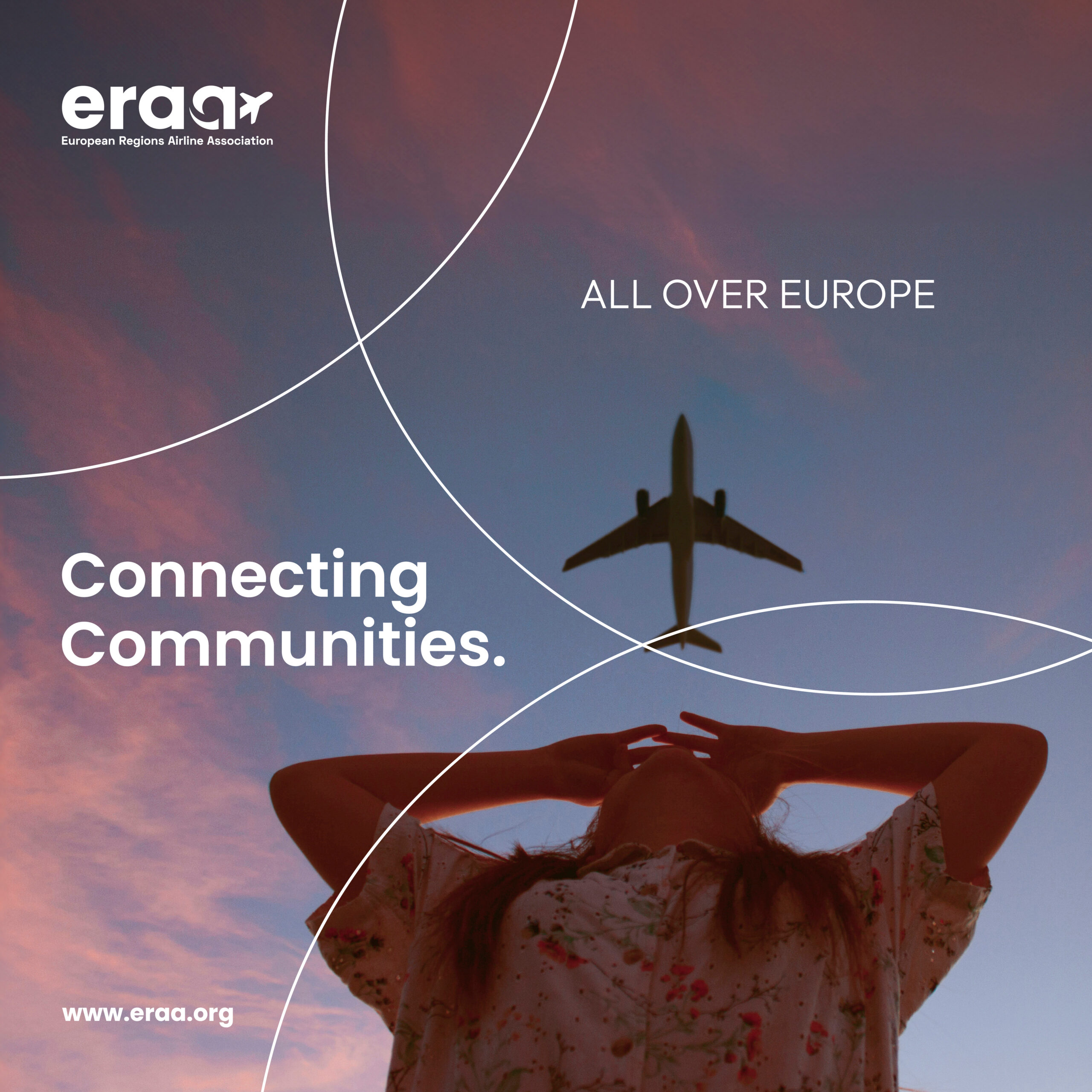
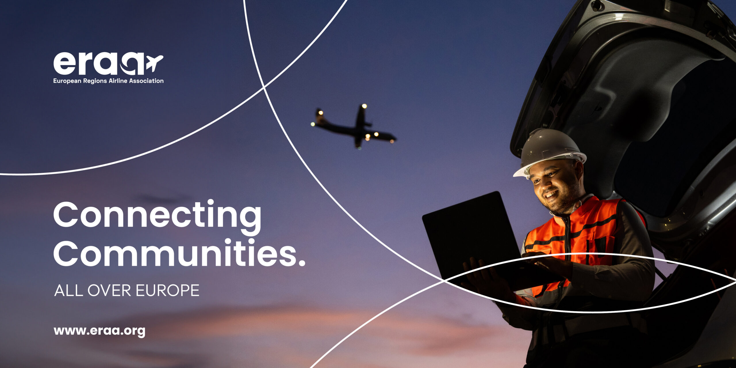
We developed a complete visual identity centred around the concept of connectivity. At the heart of the new brand is a bespoke logo combining a contemporary wordmark with an integrated aviation-inspired symbol. We created a distinctive graphic device inspired by flight paths, taxiways and regional transport networks, providing a flexible visual language that can be applied across digital, print, events and video communications.
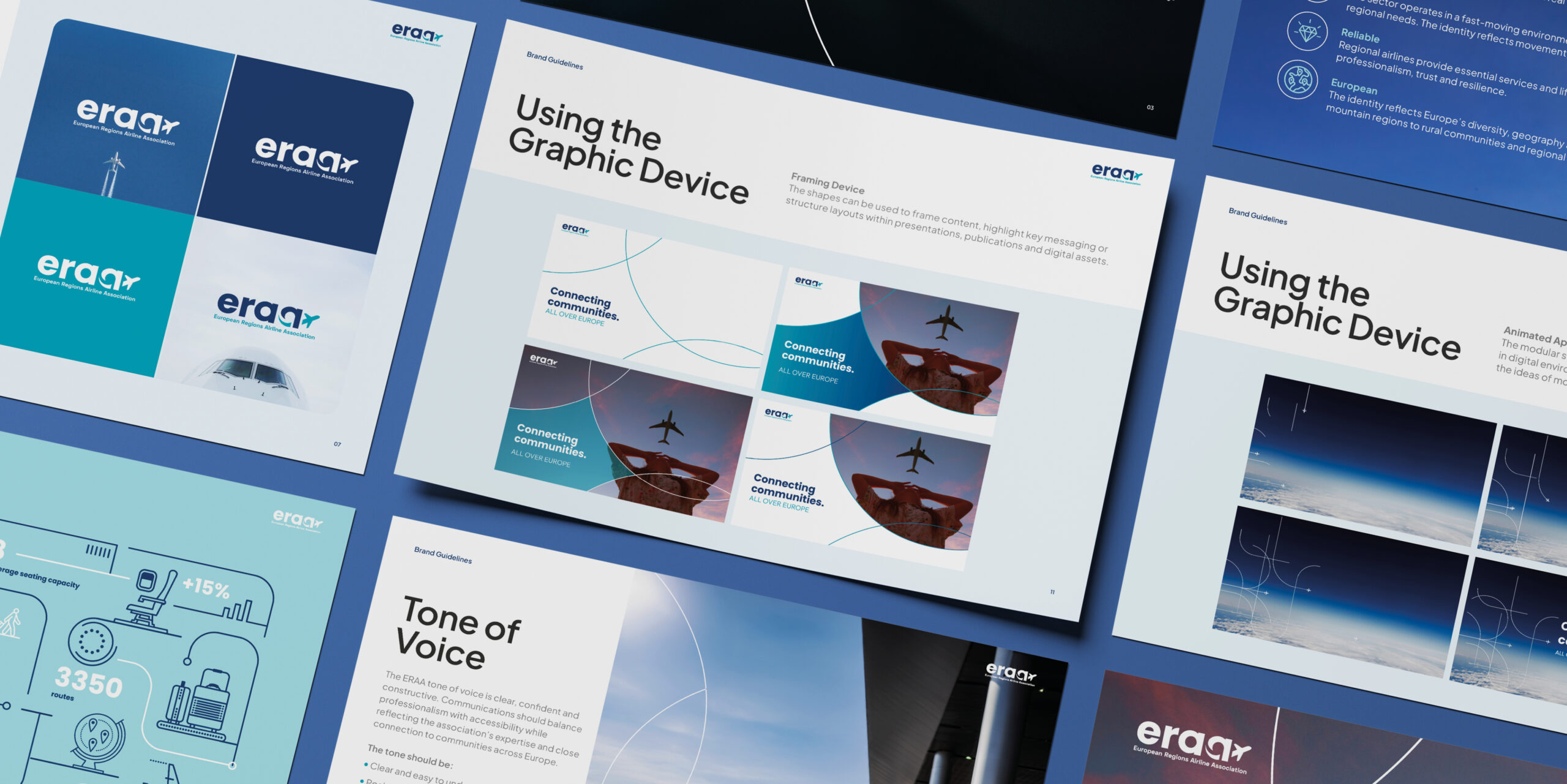
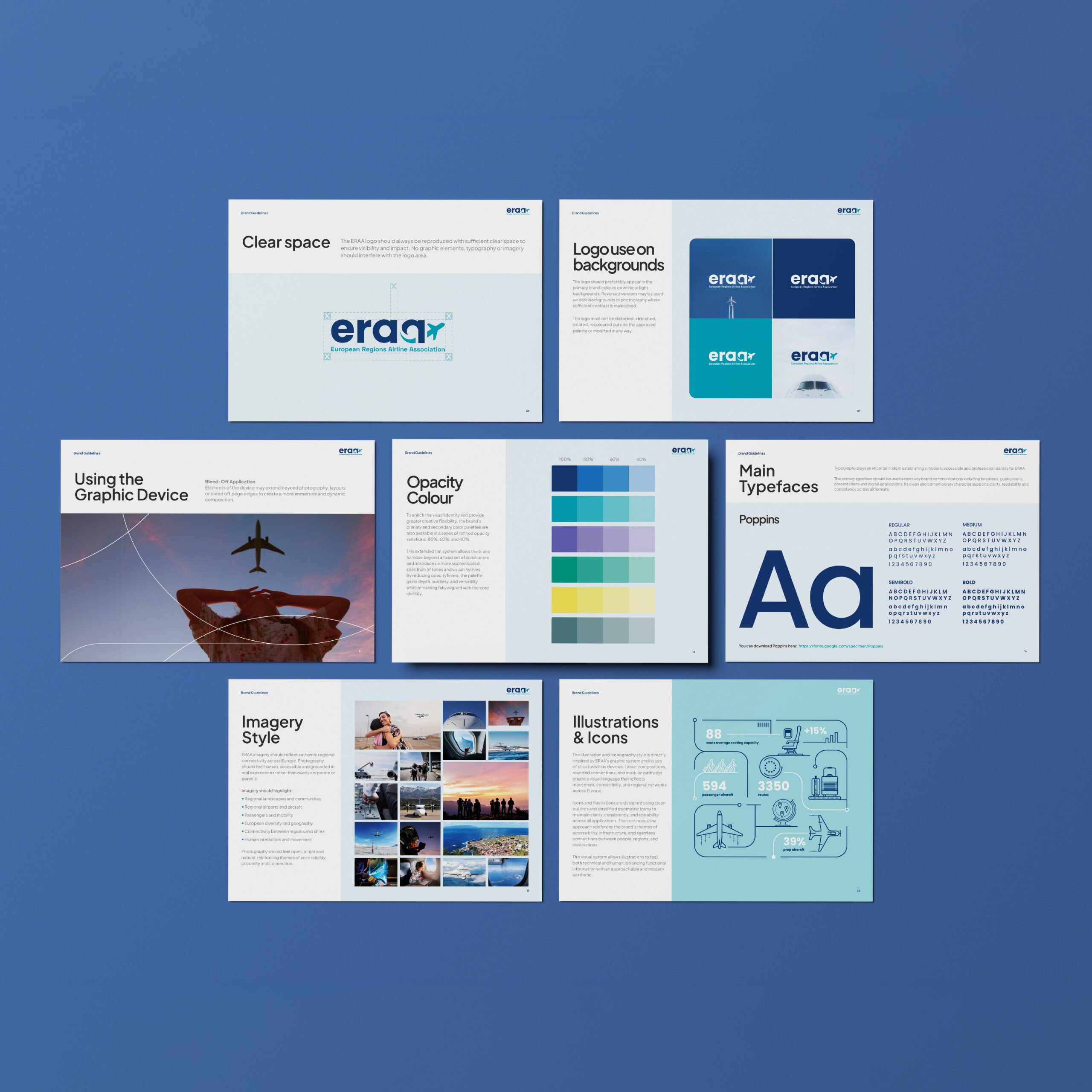
To support the new identity, we developed a comprehensive brand system including colour palettes, typography, imagery guidelines, iconography and tone of voice. The result is a coherent and highly adaptable identity that reinforces ERAA’s mission of connecting communities across Europe.
Results
The new identity provides ERAA with a distinctive and professional brand that stands out in the European aviation landscape. The visual system delivers consistency across all communications while offering the flexibility needed for advocacy campaigns, publications, events, digital platforms and social media. Most importantly, it gives ERAA a visual identity that clearly reflects its role as the voice of regional aviation and its commitment to keeping Europe connected.